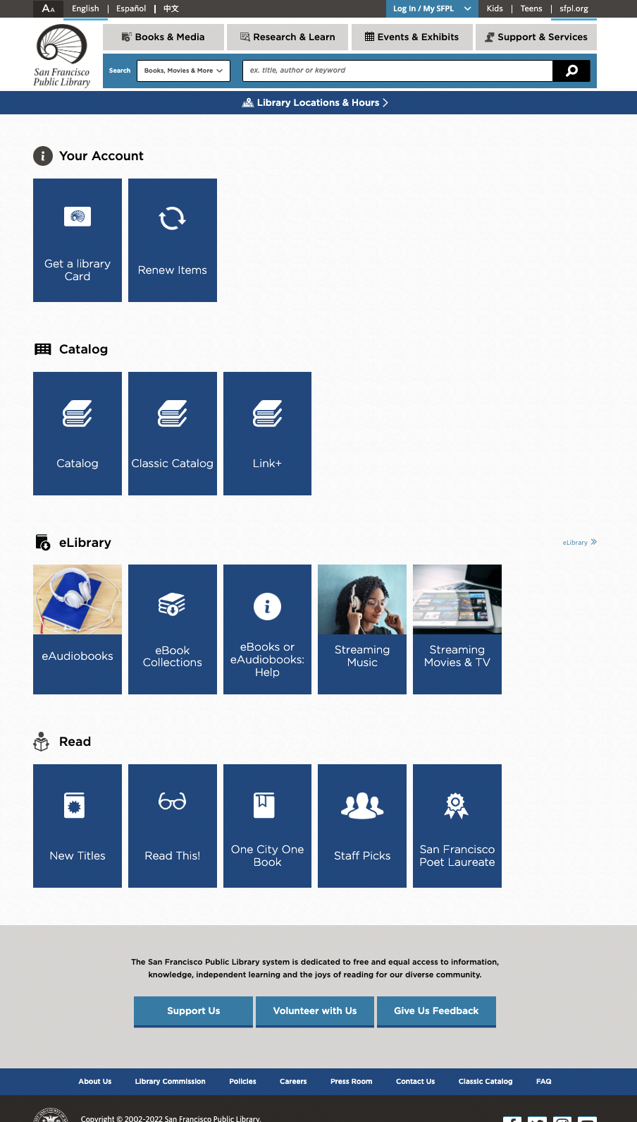
Work About Resume ↗ Contact
Product Designer · Bay Area

I design experiences
the way an engineer
thinks about them.

I'm Ravjeet Kaur, a Product Designer in the San Francisco Bay Area. After six years as a QA Engineer in enterprise software, I crossed over to design — and I brought everything with me. I understand how products break, how teams collaborate, and how to close the gap between a beautiful design and a working one.

From quality engineering
to design — on purpose.

Six years inside enterprise software taught me where products break, where users get lost, and why the gap between design intent and shipped reality matters. That background is the lens I bring to every design problem.

Read My Story →
Ravjeet Kaur, Product Designer based in the San Francisco Bay Area

Designing with the fluency of someone who's also lived on the engineering side.

I'm Ravjeet Kaur — a Product Designer in the San Francisco Bay Area with a background that most designers don't have. Before I ever opened Figma, I spent six years as a Quality Assurance Engineer inside enterprise software teams. That means I've seen products from the inside out: how they're built, where they break, and where the gap between what designers intend and what users actually experience quietly widens.

That crossover wasn't an accident — it was the most natural thing in the world. QA is fundamentally about empathy for the user filtered through technical precision. You're the person who asks "but what happens when someone does this?" every single day. Transitioning to UX was taking that instinct and making it the whole job.

My approach to design is rooted in research. I believe you can't design what you don't understand — which is why every project I take on starts with understanding who the user actually is, not who we assume them to be. I use tree testing, card sorting, usability testing, and journey mapping not as checkboxes but as genuine discovery tools.

I'm also a mother — and that role has made me a sharper designer than anything else. Parenthood trains your empathy in ways no textbook can. It teaches you to design for people who are tired, distracted, time-poor, and making important decisions under pressure. Which is, honestly, most of your users.

Design Skills

  • User Research & Interviews
  • Information Architecture
  • Wireframing & Prototyping
  • Usability Testing
  • Journey Mapping
  • Interaction Design

Tools & Methods

  • Figma
  • Miro
  • OptimalWorkshop
  • Tree Testing
  • Card Sorting
  • Agile / Sprint Cycles
Download Resume ↗
Beyond the Work

You're not just hiring my skills —
you're hiring how I show up.

I lead on the dance floor too.

I've attended and led dance workshops for years — Bollywood, group choreography, performances with teams. Dance taught me something design school doesn't: how to read a room, hold energy, and bring a group of people into sync. I'm that person who doesn't just show up — I show up and make it better for everyone around me.

I finish what I start.

Give me a trail, a deadline, or a design problem — I'll get to the end of it. Hiking taught me that the hardest part isn't the climb, it's staying committed when you can't see the top yet. That's exactly how I approach ambiguous design challenges: one step, then the next, until there's a solution worth standing on.

I'm genuinely obsessed with why people do what they do.

Human psychology isn't a side interest for me — it's a lens I can't turn off. I took a formal psychology course to go deeper, and I've kept going: child development, relationship dynamics, behavioral patterns, the gap between what people say and what they actually need. Becoming a parent accelerated all of it. My empathy didn't start there, but it's been profoundly deepened by it.

In UX, this means I never take a user's stated need at face value. I'm always listening for what's underneath — the anxiety, the habit, the workaround, the thing they've stopped trying to fix. That's where the real design opportunity lives.

Deep listener — in research and in life
Studied child-parent & human psychology
Empathy that scales to enterprise complexity
Energized by teams, not drained by them
Comfortable with ambiguity — brings clarity
Finisher — challenges are invitations
Back to Work
Product Design AR · Mobile → TV 10 Weeks

Posture Perfect — AR Fitness App

Designing a real-time posture feedback system using augmented reality to make home workouts safer, more motivating, and personalized — without a gym.

My Role

User Research, Interaction Design, Visual Design, Prototyping & Testing

Team

3 designers (cross-timezone collaboration)

Tools

Figma, Miro, Pen & Paper

Duration

10 weeks

8
Users tested in structured usability sessions across 3 issue matrix cycles
3
Major issue matrices resolved — from confusing UI patterns to AR feedback clarity
1
Bold platform pivot — from mobile to TV app, driven entirely by user feedback

Overview

Posture Perfect is an AR-powered fitness application designed for at-home workouts. The product addresses a real gap in the market: guided workout apps exist everywhere, but none offer real-time posture correction feedback — the feature that reduces injury risk and keeps users engaged long-term.

The Problem

Post-pandemic, home fitness shifted from necessity to lifestyle. Yet the apps serving this audience were built around video libraries and static images — with zero feedback on whether users were actually doing movements correctly. The result: users either got injured, felt unmotivated, or both.

"Online workout videos are not tailored as per my needs and goals."

— Research participant

Research

We conducted in-depth user interviews and surveys targeting both regular fitness enthusiasts and people trying to build a home workout habit. Three dominant themes emerged:

Flexibility

Users wanted to work out on their own schedule without gym dependency.

Social Anxiety

Many avoided gyms due to self-consciousness — home felt safer.

Pricing

Gym memberships and personal trainer costs were prohibitive barriers.

No Real-time Feedback

The absence of posture correction was the single biggest gap in existing solutions.
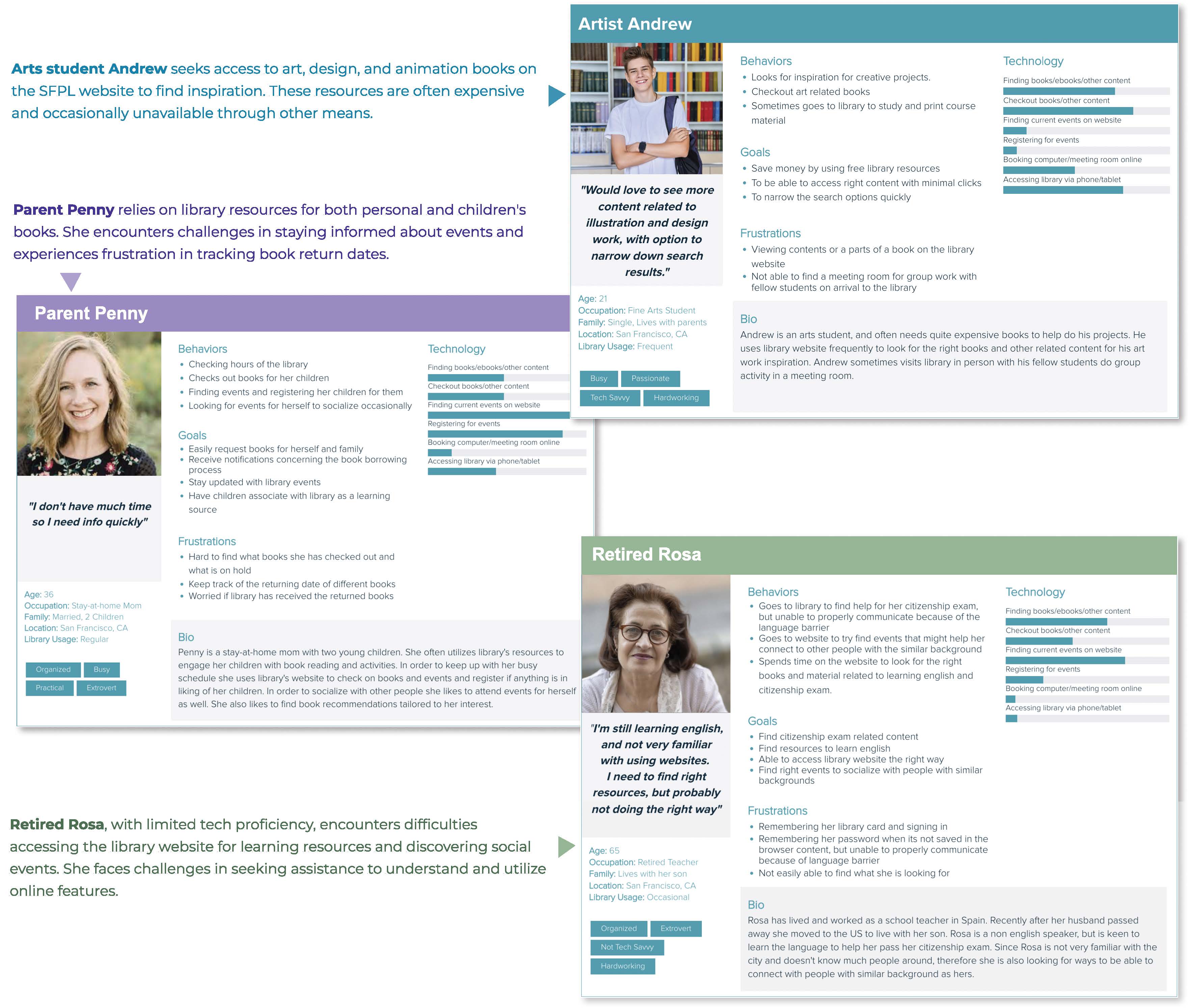
User Persona

From our research we developed "Mom Madeline" — a working parent who wants the efficiency of home workouts without sacrificing safety or motivation. Her needs anchored every design decision: convenience, real-time guidance, and gamification elements that kept her coming back.
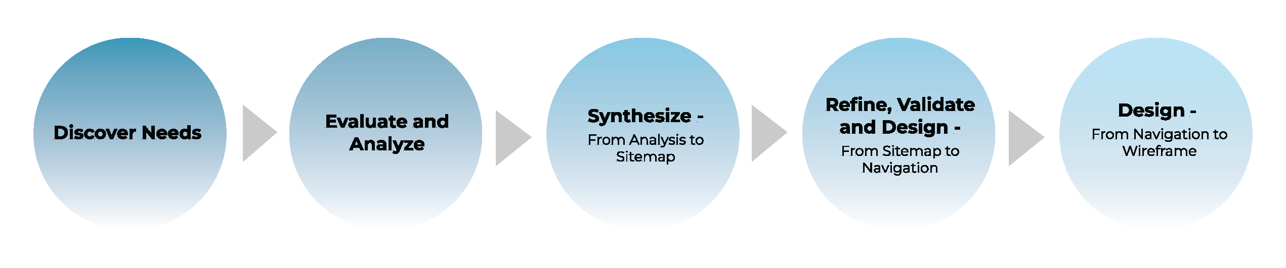
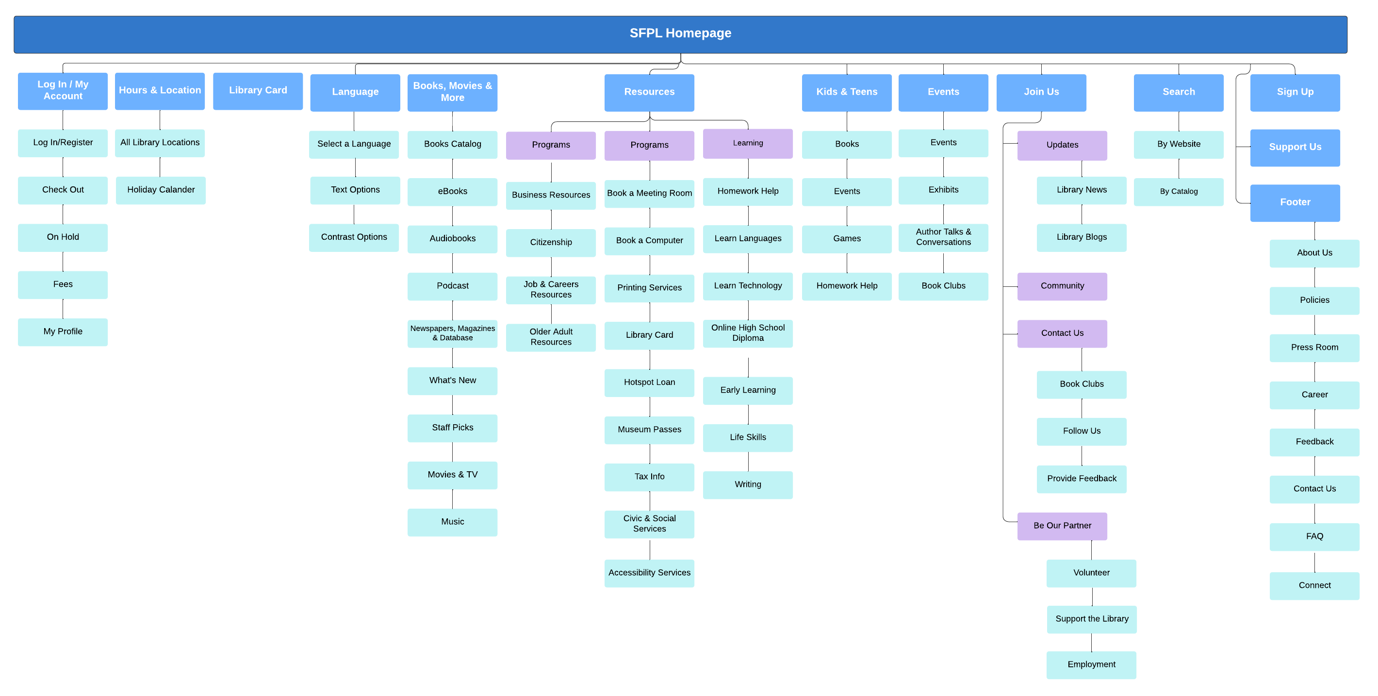
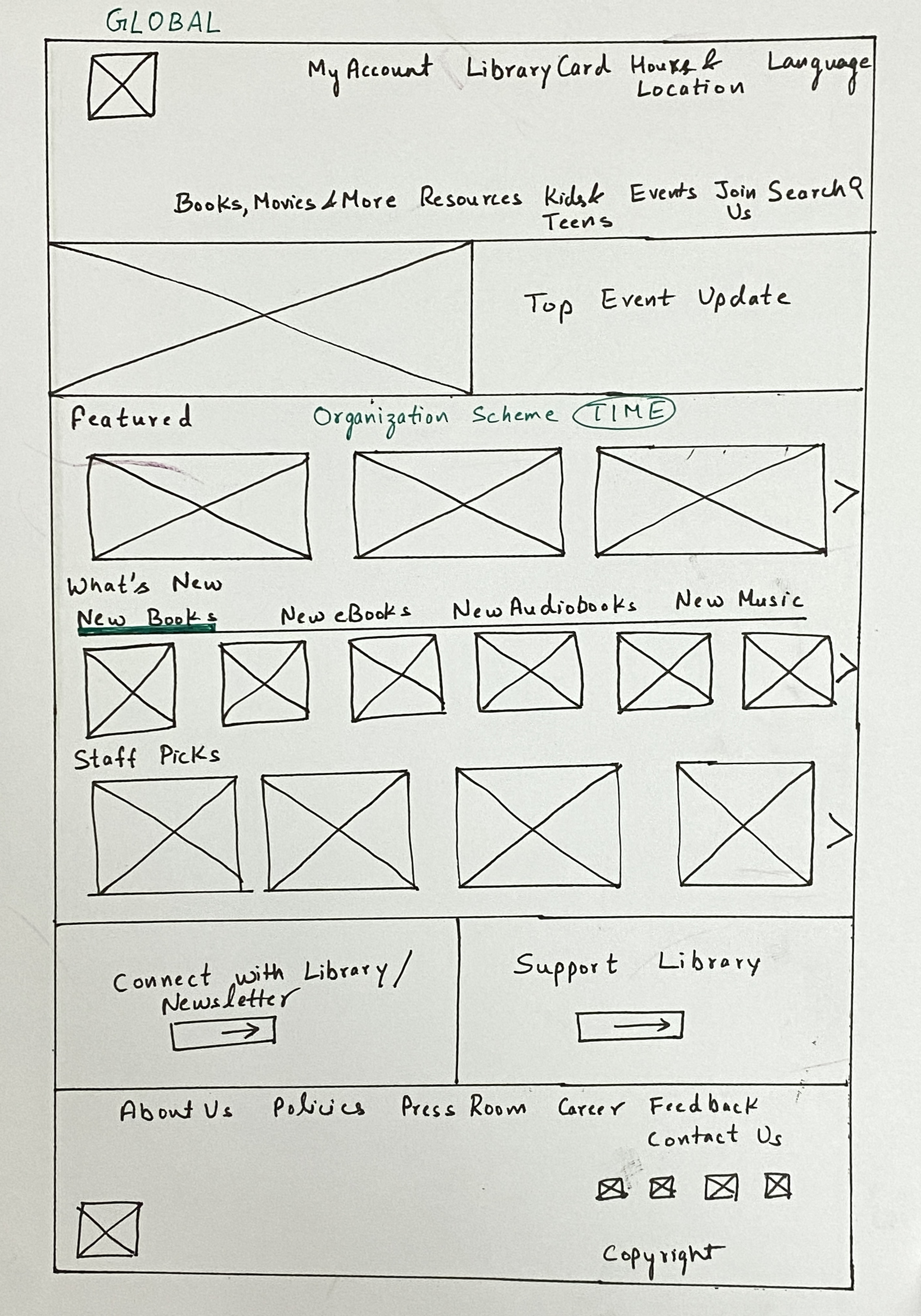
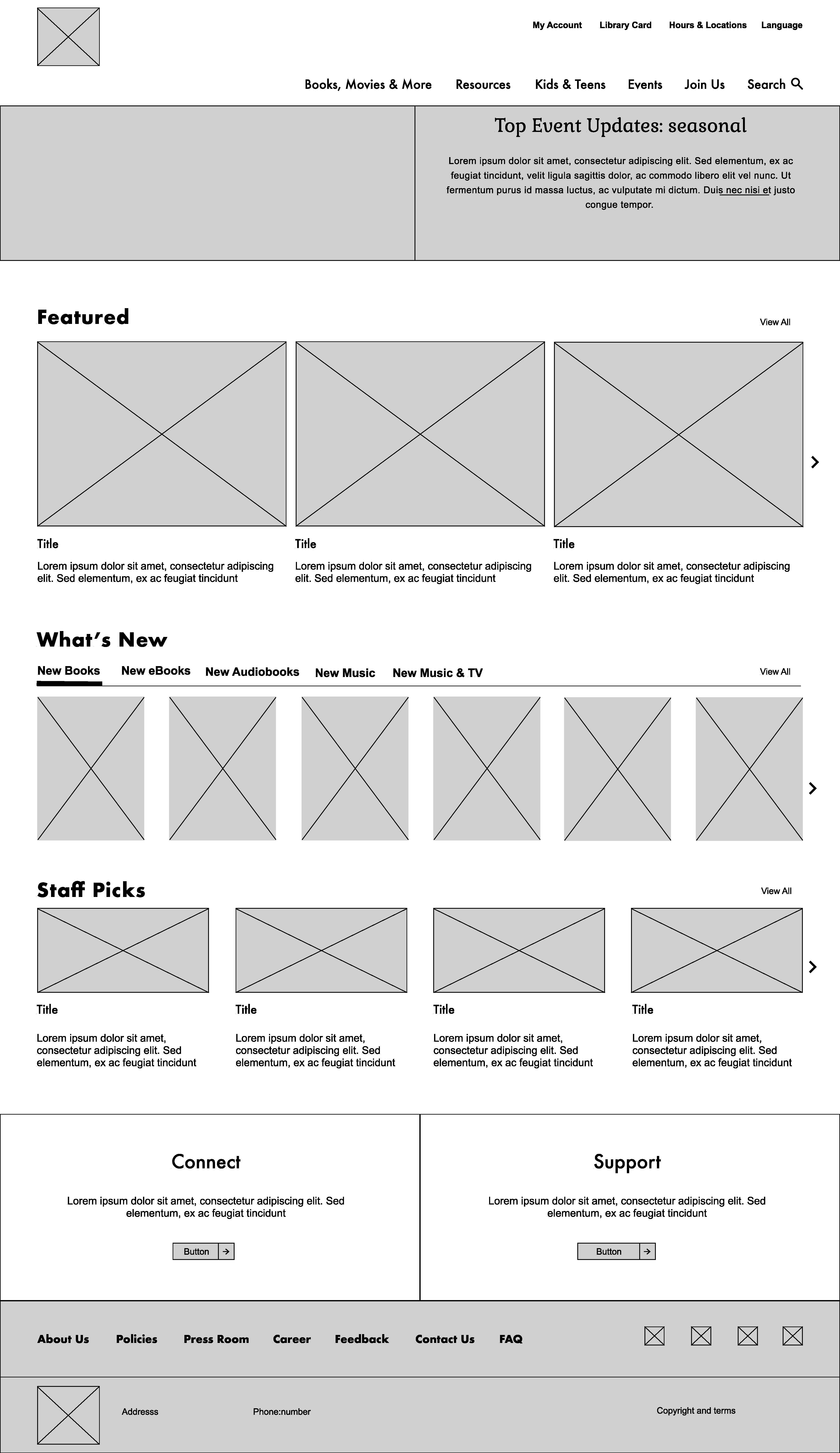
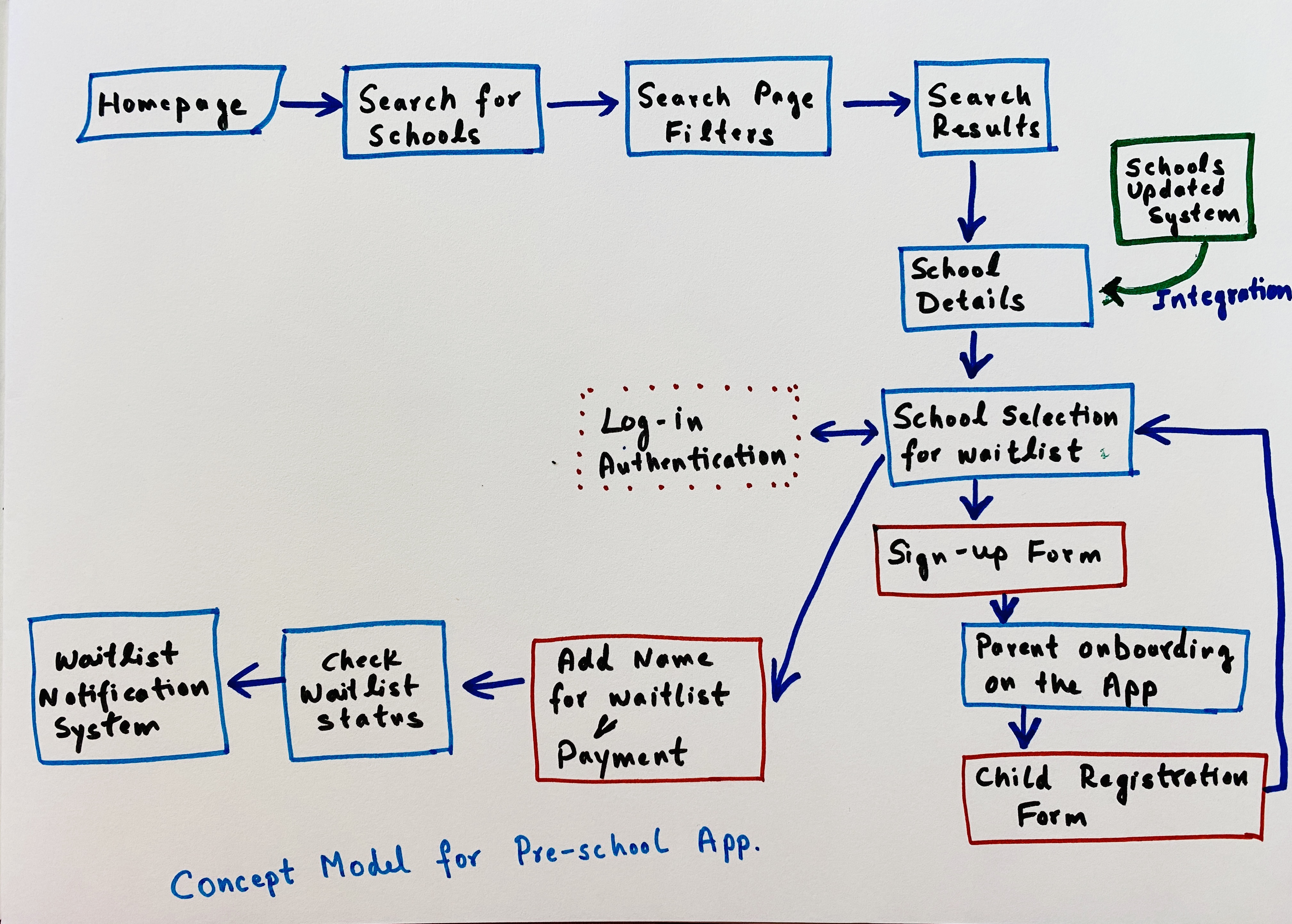
User persona: Mom Madeline — a working parent who values home workout flexibility and needs real-time feedback to stay safe and motivated

Design Process

We moved from context scenarios through sketching, wire blocks, and low-to-mid fidelity wireframes — each iteration grounded in Madeline's documented scenarios. The sketching phase focused on four core flows: choosing workouts, performing movements with AR feedback, tracking progress, and motivational elements.

Customer journey map for Posture Perfect showing pre-phase, during-phase, and post-phase touchpoints for Mom Madeline

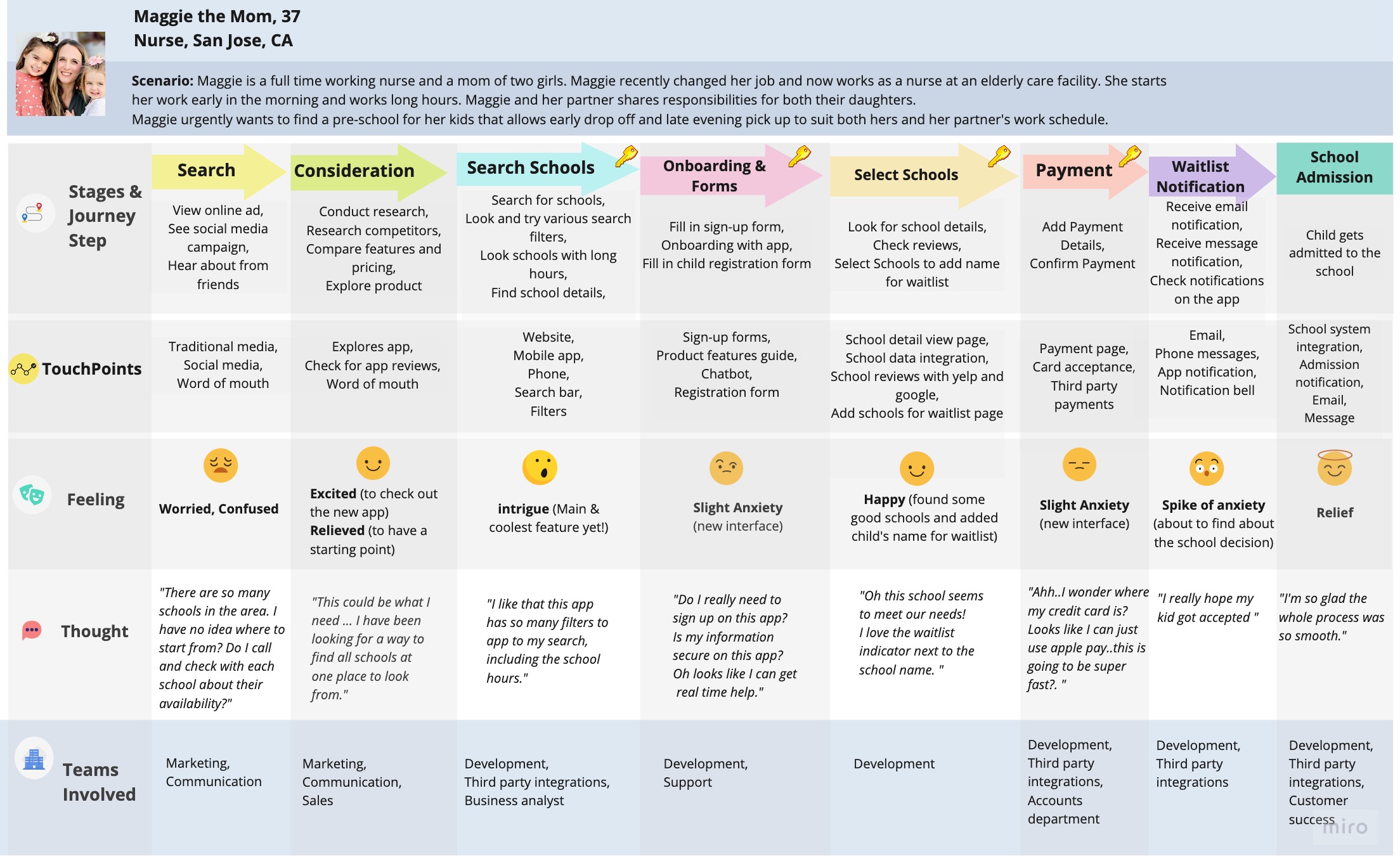
Customer Journey Map — Pre, During, and Post workout phases

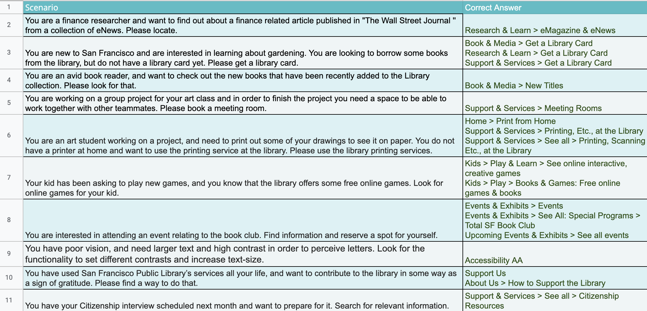
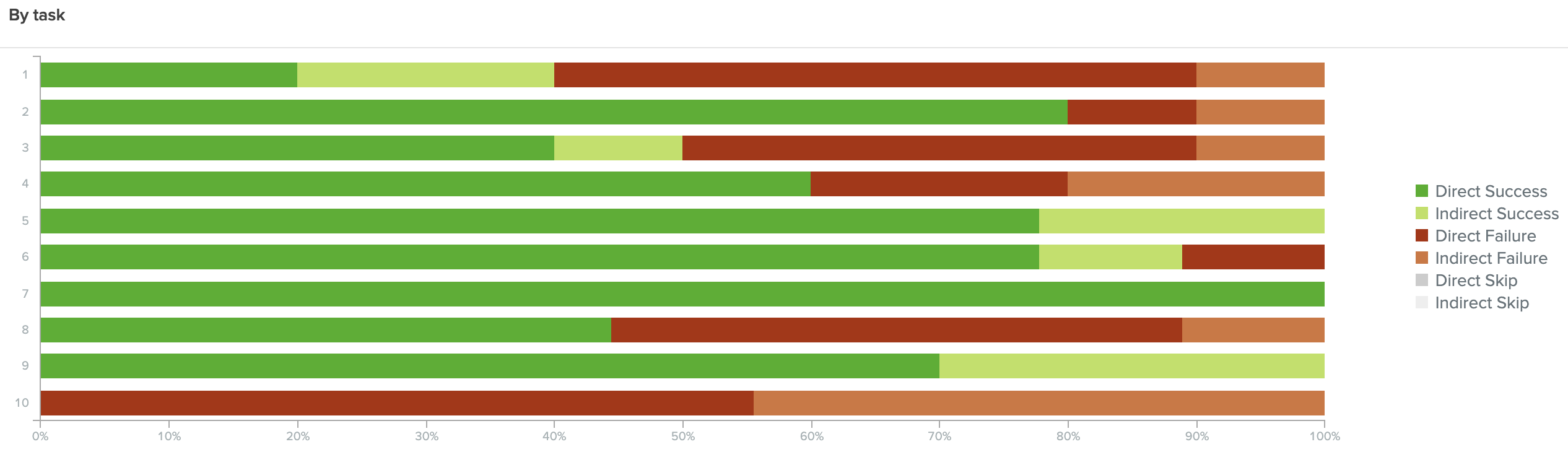
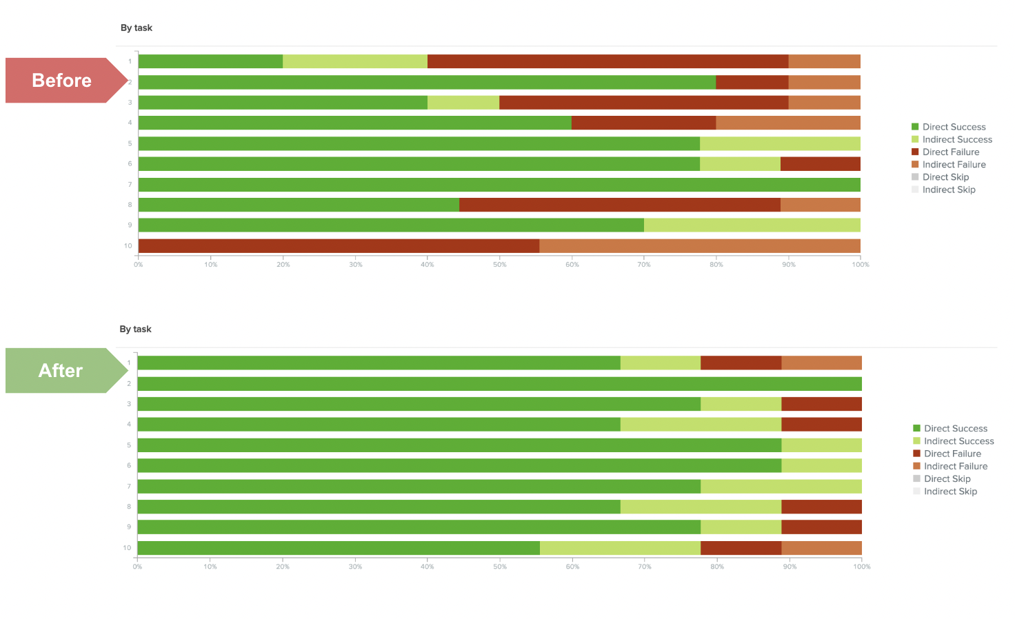
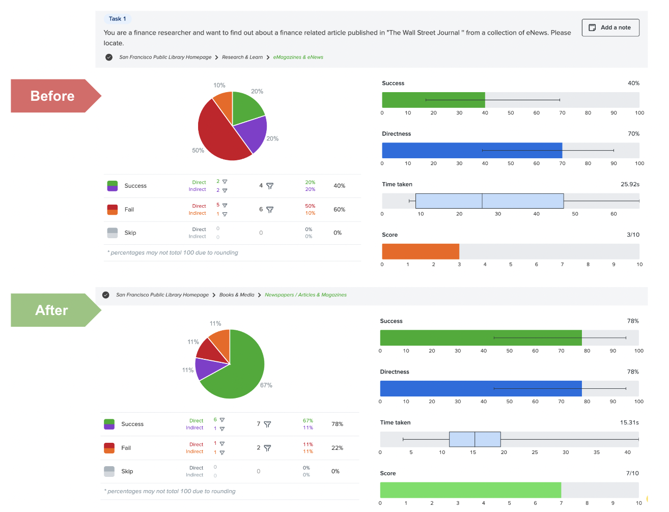
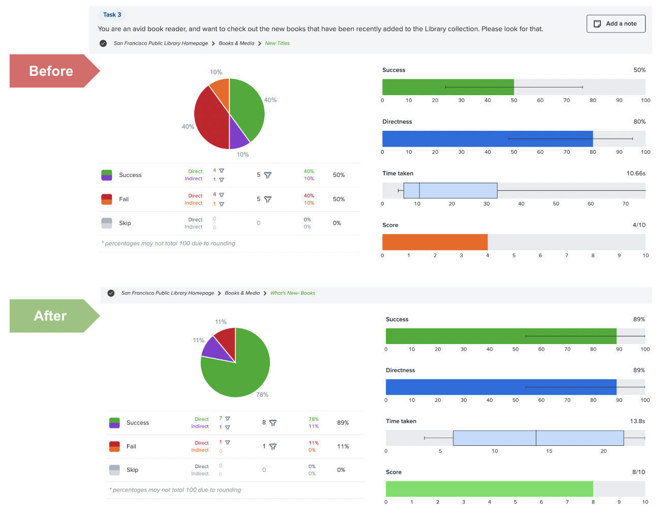
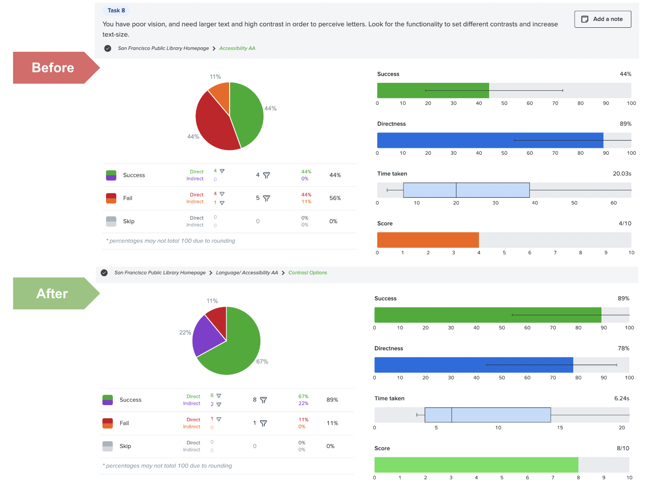
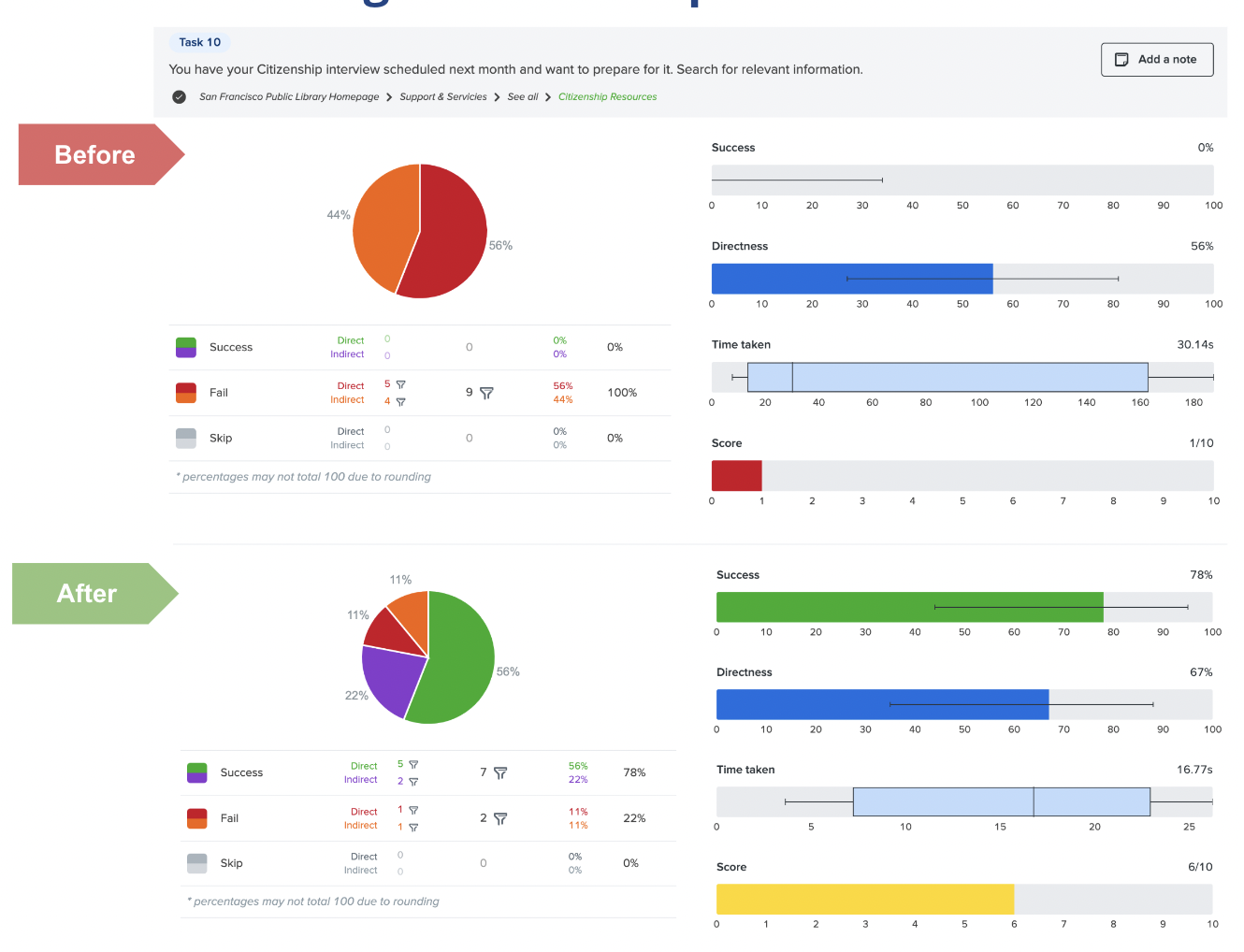
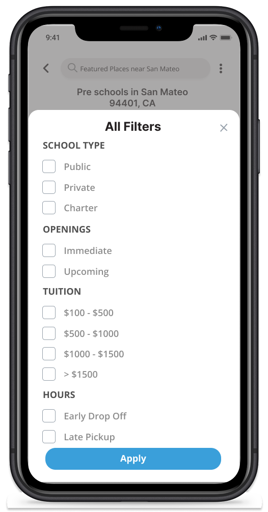
Usability Testing & Issue Resolution

We ran structured usability testing with 8 participants across three issue matrix cycles. Each cycle identified problems, rated them by impact and frequency, and drove specific design changes:

Issue Matrix 1

Play/heart icon confusion, missing workout filters, readability problems on-screen during exercise.

Issue Matrix 2

Two simultaneous timers confused users; no body scan indication; continued readability issues.

Issue Matrix 3

Live feedback popups were distracting; silhouette should always show correct posture; no completed exercise indicator.

Platform Pivot

Critical feedback led to the most significant decision: switching from mobile to TV app. A bold call — and the right one.
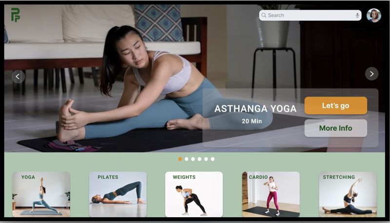
Final Designs

The final product delivers a TV-optimized AR fitness experience with a live instruction screen, real-time posture correction overlays, and a wind-down session post-workout. The design system ensures visual consistency across the experience.

Posture Perfect TV app home screen — high fidelity final design showing workout selection interface

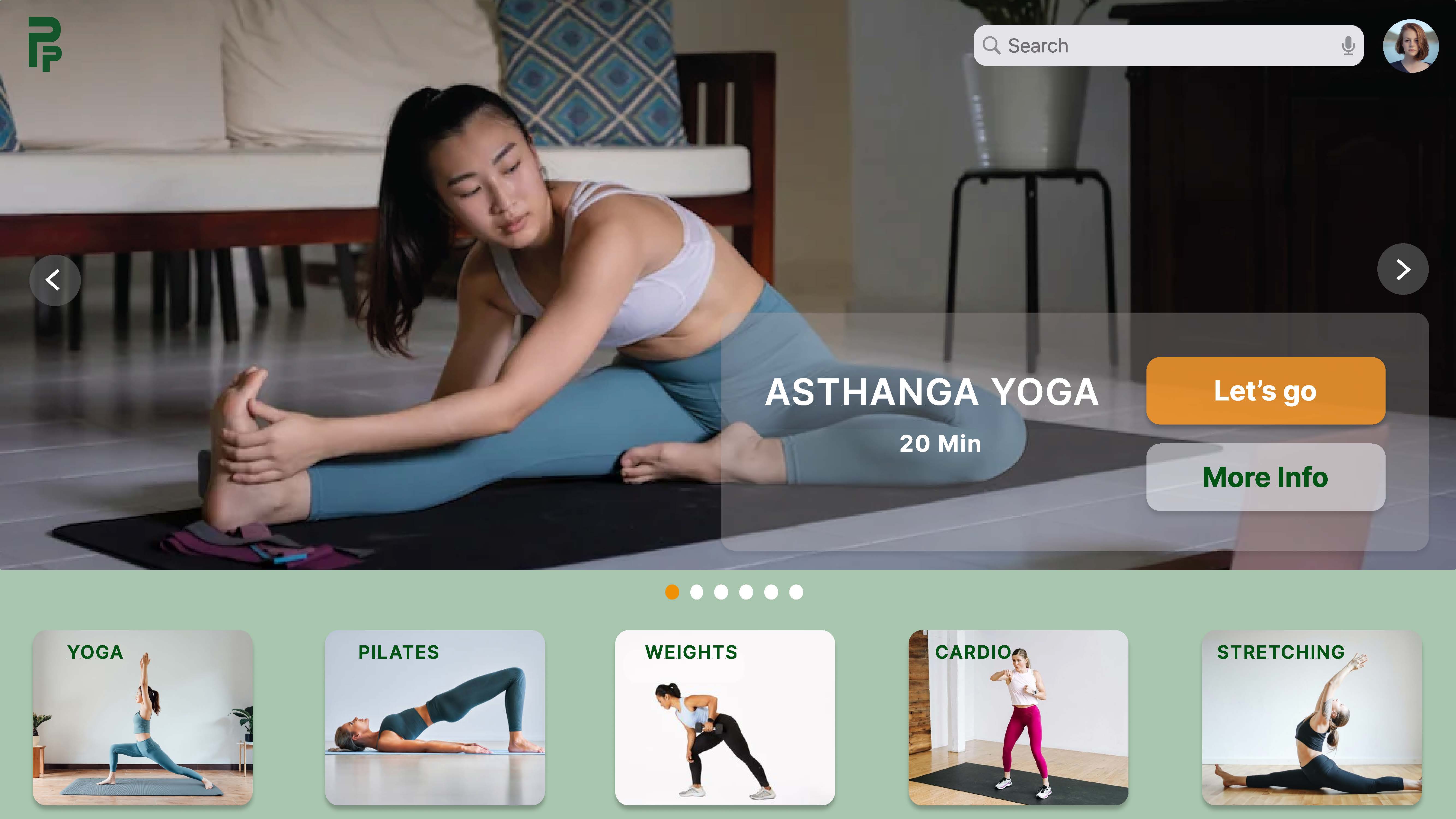
Home Screen — Hi-Fi Design

Posture Perfect wind-down screen — workout completion with cool-down session option

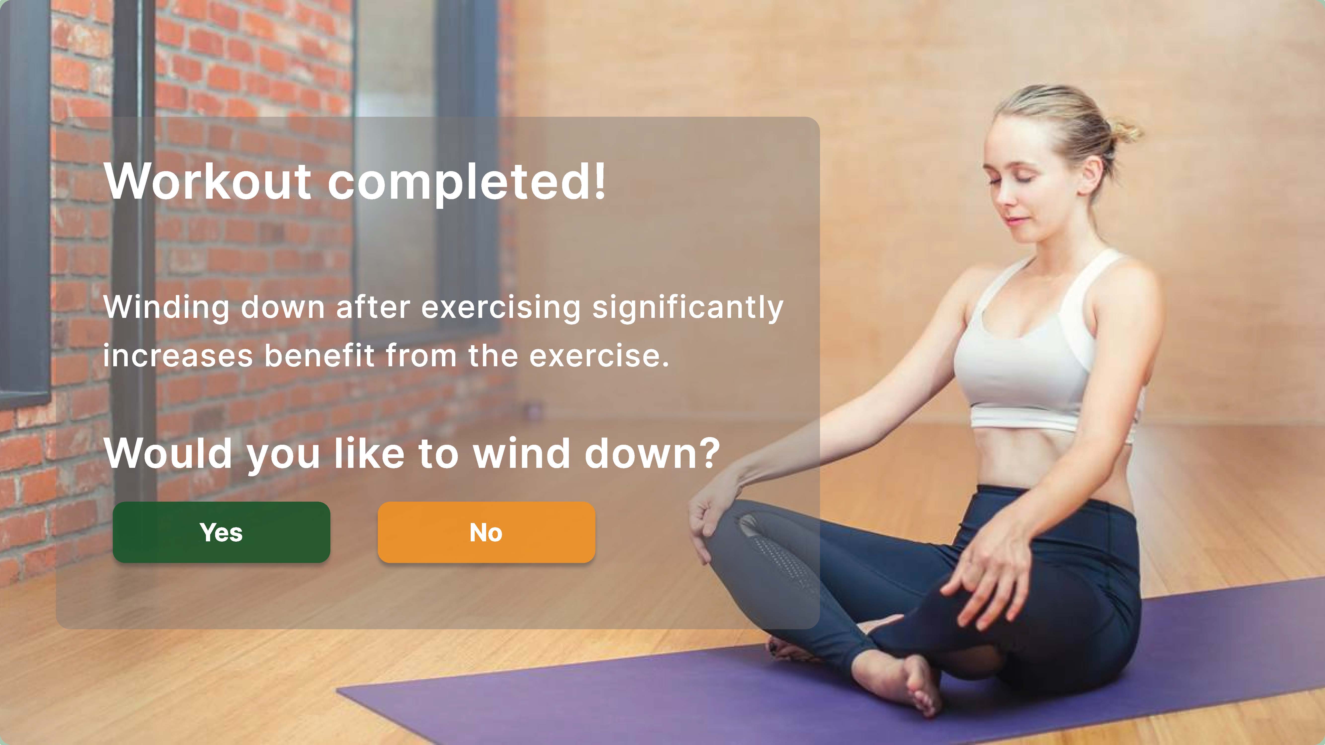
Workout Completion — Wind Down Screen

Posture Perfect design system — color palette, typography, and component library

Design System

Challenges & Learnings

The most significant challenge — and the most valuable learning — was executing a full platform pivot mid-project. Switching from mobile to TV app based on user feedback required rebuilding interaction patterns from scratch. It was uncomfortable. It was also exactly what user-centered design demands: following the evidence, not the original plan.

Coordinating across time zones within the team strengthened our async collaboration habits — a skill that translates directly into distributed product team environments.

Back to Work
Information Architecture UX Research Solo 6 Weeks Figma LucidChart OptimalWorkshop Excel

San Francisco Public Library — IA Redesign

Rebuilding the information architecture of a major public institution's website through rigorous tree testing, card sorting, and label scoring — improving task success from 66% to 91%.

Homepage Navigation

Books, Movies & More

66→91%
Overall task success rate — a 25-point improvement through IA redesign alone
100%
Tasks with improved direct success rate (8 of 10 exceeded 75% direct success)
0→78%
Citizenship services findability — from complete failure to 78% success

Overview

The San Francisco Public Library serves a diverse community with a mission of free and equal access to information. Despite that mission, the website's information architecture was creating real barriers — confusing labels, overwhelming navigation, and content organization that didn't match how users actually think about library services.

San Francisco Public Library website overview showing the existing design challenges

The Problem

An initial audit of 26 pages revealed systematic problems: information overload, misleading navigation labels, and an architecture built around internal organizational logic rather than user mental models. The gap between what the library offered and what users could actually find was significant.

Process

Information architecture process diagram showing the five phases: Discover, Evaluate, Synthesize, Refine, and Design

Discovering User Needs

I began with a comprehensive exploration of the site across three UX dimensions: user needs, business goals, and content offerings. From this analysis, I compiled 26 common tasks that users would realistically attempt on the SFPL site — from finding books to accessing citizenship services.

26 common user tasks on the SFPL website compiled through analysis of user needs and site content

26 Common User Tasks identified for SFPL

Developing Personas

Three personas were developed to represent the breadth of SFPL's actual audience — a student researcher, a parent accessing children's programs, and an older adult seeking community resources. Each highlighted different navigation priorities and pain points.

Three user personas for the SFPL redesign representing different library visitor segments with distinct needs and tech proficiency levels

User Personas — Student, Parent, Community Member

Evaluate and Analyze

The main objective was to check if the SFPL website meets user expectations. Through a Gap Analysis of about 26 pages, I grasped the content and objectives. Simultaneously, I explored potential areas for improvement to refine the user experience.

Gap analysis results showing discrepancies between user needs and current SFPL website content and structure

Gap Analysis Results

Tree Testing — Baseline

I conducted a comprehensive Tree Test using OptimalWorkshop with 10 participants spanning ages 17–67. The SFPL sitemap was imported to create the tree structure. Participants completed 10 tasks against the current site structure.

Tree structure of SFPL website part 1 — showing the existing information architecture used for tree testing

Tree Structure of SFPL Website — Part 1

Tree structure of SFPL website part 2 — continuation of the existing information architecture

Tree Structure of SFPL Website — Part 2

Tree testing scenarios and correct answers — 10 tasks with clear scenarios selected for participant testing

Tree Testing — Scenarios and Correct Answers

Tree testing results before redesign showing 66% overall success rate and multiple task failures

Tree Testing Results — Before Redesign

66% Success Rate

Overall task success — well below acceptable UX thresholds for a public service.

4 Tasks Failed >50%

Tasks 1, 3, 8, and 10 had majority failure rates — indicating systemic label problems.

Task 10: 100% Failure

Complete failure on one task — zero users found the correct path through the existing structure.

High Time Spent

At least 4 tasks took 15–50 seconds, signaling users were searching — not navigating.

Card Sorting

Card sorting was conducted to unravel the SFPL user's mental model. 11 participants total — 3 in-person and 8 online — worked with 30 cards. On average, participants created 8 groups, revealing natural clustering patterns that differed significantly from the existing navigation structure.

Similarity Matrix

Similarity matrix from card sorting showing how participants organized and grouped SFPL content categories

Similarity Matrix — Participant grouping patterns

Dendrograms

Dendrogram visualization showing hierarchical clustering of card sorting results — revealing users' natural mental model for organizing library content

Dendrogram — Hierarchical clustering from card sort results

Best Merges

Best merge analysis showing participant agreement on category groupings from card sorting

Best Merge Analysis

Abstract IA & Site Map

Abstract information architecture developed from card sorting insights showing new category structure for SFPL

Abstract IA — Derived from card sorting insights

Initial site map developed from the abstract IA showing the proposed SFPL website structure

Site Map — First iteration

Building the New IA

Card sorting insights drove a new abstract IA and sitemap. I then applied Label Scoring — evaluating each proposed label against five criteria: Well-known, Easy, Real, Brief, and Representative. Labels scoring 0–2 required changes; labels scoring 4–5 were kept.

Label scoring matrix evaluating navigation labels against five criteria: well-known, easy, real, brief, and representative

Label Scoring — Evaluating each navigation label

Two navigation options emerged. After careful consideration I selected the Hybrid Approach for its balance of familiar structure with task-based sub-navigation.

Comparison table showing Navigation Option 1 Traditional Approach versus Navigation Option 2 Hybrid Approach

Navigation Options Comparison

Navigation Option 1 — Traditional approach showing standard hierarchical menu structure for SFPL

Nav Option 1 — Traditional Approach

Navigation Option 2 — Hybrid approach combining traditional structure with task-based sub-navigation

Nav Option 2 — Hybrid Approach (selected)

Tree Testing — Validation

The Hybrid Approach was tree-tested against the same 10 tasks. The results validated the approach across every measurable dimension — each comparison below shows before vs. after:

Tree testing comparison 1 — substantial improvement in both task completion time and success rate

Comparison #1 — Task completion time and success

Tree testing comparison 2 — improvement in task success rate and directness across tasks

Comparison #2 — Task success rate and directness

Tree testing comparison 3 — new article findability improved from 40% to 78% success rate

Comparison #3 — New article findability: 40% → 78%

Tree testing comparison 4 — recently added books findability improved from 50% to 89% success rate

Comparison #4 — Recently added books: 50% → 89%

Tree testing comparison 5 — website accessibility findability improved from 44% to 89% success rate

Comparison #5 — Website accessibility: 44% → 89%

Tree testing comparison 6 — citizenship services findability improved from 0% to 78% success rate

Comparison #6 — Citizenship services: 0% → 78%

91% Success Rate

Up from 66% — a 25-point improvement on the same tasks with the same user profile.

8/10 Tasks >75% Direct

Participants were finding the right path directly, without backtracking.

Citizenship: 0→78%

The task with 100% failure in the original now succeeded for 78% of participants.

New Books: 50→89%

A label rename alone drove a 39-point success rate improvement on one task.

Final Site Map

Final SFPL sitemap showing the redesigned information architecture with improved hierarchy and task-based organization

Final Site Map — Post-redesign IA

Wireframes

With the IA validated, I moved from paper sketches through low-fidelity to high-fidelity mockups.

Sketches

Hand-drawn sketch of the redesigned SFPL homepage showing initial layout concepts

Sketch — Homepage

Hand-drawn sketch of the Books, Movies and More page showing proposed layout

Sketch — Books, Movies & More Page

Low Fidelity Wireframes

Low fidelity wireframe of the SFPL homepage showing content hierarchy and navigation structure

Lo-Fi Wireframe — Homepage

Low fidelity wireframe of Books, Movies and More page showing local navigation and content organization

Lo-Fi Wireframe — Books, Movies & More Page

High Fidelity Wireframes

Homepage — Improved IA

SFPL homepage high-fidelity wireframe showing improved navigation hierarchy and content organization based on the new information architecture

Hi-Fi Wireframe — Homepage (Improved IA)

Homepage — Existing IA (for comparison)

Original SFPL homepage showing the existing information architecture before redesign

Original Homepage — Existing IA

Improved Search Bar

High fidelity design of the improved SFPL search bar with contextual suggestions and clearer interface

Hi-Fi — Improved Search Bar

Improved Sub Navigation

SFPL improved top navigation design showing hybrid approach with clear labels and sub-navigation structure

Hi-Fi — Improved Top Navigation (Hybrid Approach)

Books, Movies & More — Improved IA

High fidelity wireframe of the Books Movies and More page with local navigation and improved content organization

Hi-Fi — Books, Movies & More (Improved IA)

Books, Movies & More — Existing IA (for comparison)

Original Books Movies and More page showing the existing layout before redesign

Original Books, Movies & More — Existing IA

Results & Impact

91% Task Success

Up from 66% — the new tree structure and labels drove a 25-point improvement.

Simplified Navigation

Clear global labels and sub-navigation replaced the confusing original structure.

Local Navigation Added

Books, Movies & More page now has local navigation for quick content access.

Label Repetition Eliminated

Updated homepage content organisation removes duplicate and misleading labels.

Challenges & Learnings

Starting with a 100% failure rate on one task was jarring — and instructive. It confirmed that good intentions in site structure don't translate to usable navigation without user validation. The iterative approach — test, analyze, restructure, test again — was the only path to a result grounded in real evidence rather than designer assumptions.

Back to Work
Mobile UX Prototyping Usability Testing Solo 8 Weeks

WaitNoMo — Preschool Finder App

Designing a mobile platform that consolidates fragmented preschool information, surfaces real waitlist data, and gives anxious parents confidence in one of the most emotionally charged decisions they'll make.

My Role

User Research, Prototyping, Usability Testing

Team

Solo

Tools

Figma, Miro, Pen & Paper, Zoom

Duration

8 weeks

15
Parents interviewed in depth to surface real pain points in preschool search
5
Moderated usability sessions with Zoom screen recording and structured task analysis
↓ Overwhelm
Validated reduction in user anxiety through simplified, consolidated interface

Overview

WaitNoMo is a mobile application designed to help busy parents research, shortlist, and enroll their children in preschools — all in one place. The product addresses a deeply stressful life event that currently has no reliable, consolidated digital solution.

The Problem

Preschool enrollment is emotionally high-stakes and logistically chaotic. Parents navigate scattered websites, outdated information, opaque waitlists, and reviews they can't trust. The experience is designed around administrative convenience — not around parents who are time-poor, emotionally invested, and making a decision that affects their child's development.

Fragmented Information

No single source consolidated location, ratings, hours, cost, and waitlist status.

Waitlist Opacity

Parents had no visibility into real-time availability or where they stood in queues.

Trust Gap

Online reviews were unreliable, unverified, and often outdated.

Enrollment Friction

Each school had its own registration process — no standardization, no simplicity.

User Research

I conducted in-depth interviews and surveys with 15 parents. Research focused on the full preschool search journey — from initial awareness through enrollment — capturing emotions, workarounds, and friction points at every stage. These conversations informed the product's core feature set and prioritization.

Research synthesis showing key parent pain points: information overload, trust issues with reviews, and waitlist frustration

Research Synthesis — Key Parent Pain Points

Concept Model & Ecosystem Map

A Concept Model visualized how the app's three core features — Search, Waitlist Updates, and Enrollment — interconnected. This guided the design direction and ensured we weren't designing isolated features but an integrated flow.

The Ecosystem Map extended this to identify all touchpoints in the parent's journey, both within and outside the app — school communication systems, email/SMS notifications, and follow-up activities that the app needed to account for at its edges.

Concept model diagram showing relationships between WaitNoMo's core features: search, waitlist management, and enrollment

Concept Model — Core Feature Relationships

Persona & Journey Map

Maggie — a working mother with limited time — became the design's anchor persona. Her journey map tracked emotional states across searching, waitlisting, and enrollment, revealing the moments of highest anxiety (waitlist submission) and highest relief (confirmation notifications). These peaks and valleys directly shaped the app's notification design and information hierarchy.

Customer journey map for Maggie showing emotional states, actions, and touchpoints across the preschool search and enrollment process

Customer Journey Map — Maggie's Preschool Search Experience

Usability Testing

Five moderated usability sessions were conducted using Zoom screen recording. Participants completed core tasks: searching with filters, adding schools to favorites, and checking waitlist notifications. Key findings shaped final design decisions:

"The filters were exactly what I needed — I could narrow it down so fast."

— Usability testing participant

Filters: Validated ✓

Search filters by location, budget, hours, and rating were the most valued feature across all participants.

Map View: Validated ✓

"View on Map" was immediately useful for parents reasoning about school location relative to home or work.

Favorites: Validated ✓

Quick shortlisting via favorites icon reduced cognitive load during comparison.

Search Bar: Iterated

Default "zip code" placeholder created confusion — changed to "Start the school search" to make the intent personal and clear.

Final Designs

The final mobile interface delivers a consolidated, trustworthy experience across the full enrollment journey — from initial search through waitlist management. Every screen was validated against Maggie's needs and the usability testing findings.

WaitNoMo search results page showing school listings with ratings, location, and waitlist status on iPhone

Search Results — School Listings with Real-time Waitlist Data

WaitNoMo map view showing preschool locations relative to user's home with distance indicators

Map View — Spatial Preschool Discovery

WaitNoMo search filter panel showing options for location, budget range, hours, school type, and ratings

Search Filters — Location, Budget, Hours, Type, Ratings

Challenges & Learnings

The emotional dimension of this project was its biggest design challenge. Preschool enrollment isn't just a logistical problem — it's a trust problem. Parents aren't just finding a school; they're making a decision about their child's safety and development with imperfect information. Designing for that emotional context required extra care in copywriting, information hierarchy, and the way data was surfaced.

The search bar copy change — from "zip code" to "Start the school search" — was a small tweak with outsized impact. It's a reminder that microcopy is UX.